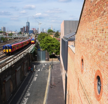
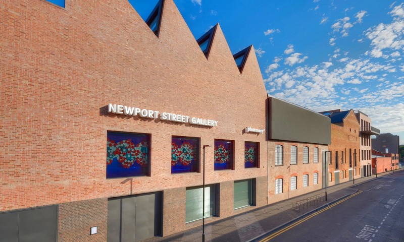
Wandering around the backstreets of Vauxhall, between the rumbling railway viaduct and council housing blocks, you might not realise Damien Hirst’s £25m new gallery had landed. For an artist who used to chop up cows and ambush people with his foreskin, his new south London HQ is notably subdued. The facade is not encrusted with dead butterflies nor diamond skulls, nor is there the clinical air that his eerie white production facility in Gloucestershire exudes. In fact, it looks a bit like a block of luxury docklands apartments – a couple of old brick warehouses with a polite in-keeping brick extension. Has the 50-year-old prankster finally grown up?
The 37,000 sq ft Newport Street Gallery, which opens on Thursday, free to all, is the work of Caruso St John, architects of the recent Tate Britain revamp, New Art Gallery Walsall, Nottingham Contemporary and a growing empire of galleries for art dealer Larry Gagosian, making them Britain’s go-to practice for art spaces. They have brought their usual subtle magic to extending and converting these listed Victorian warehouses, in one of their most understated projects to date.
“They’re not warehouses,” corrects Peter St John, an architect who speaks with professorial precision. “They are very special, listed scenery-painting workshops, which were built to supply the booming West End theatres.” Inside these sturdy brick shells were cathedral-like spaces 11, 14 and 15 metres high (the feature that attracted Hirst to buy them in 2002 and use them briefly as his own studio). Now fitted with a second floor, they still make a lofty suite of six galleries, rising to an airy eight metres on the ground floor, six metres on the upper level.
A poster for Chitty Chitty Bang Bang adorned the facade for years, but has now been replaced by an enormous LED screen facing the railway tracks – a genius marketing move that will enliven the morning commute. As might the big balcony that projects from Hirst’s private penthouse viewing room (a vantage point that will perhaps provide him with an irresistible opportunity for a cheeky flash at passing trains).
Bookended by two new brick buildings on either side, the composition makes a pleasingly jumbled terrace with a bulky industrial character, presenting a sheer wall towards the railway viaduct, punctuated with big windows and tall metal doors. The new block at the end of the street is crowned with a saw-tooth roof of industrial north-lights, each tilted at a progressively steeper angle, like a line of dominoes beginning to topple. This was done, says St John, to “give a very slight emphasis towards the front” and to “make it more lively from the outside”.

It is barely perceptible, but it makes a difference – like many such details found within. Throughout, there are the hallmarks of Caruso St John’s obsessive precision, which can verge on psychotic. Like a dog’s hearing, their sensory perception operates on another level to most architects. They see and feel with extraordinary sensitivity and, more importantly, can guide their builders to achieve levels of finish that are on another plane – a skill clearly aided here by Hirst’s ample budget.
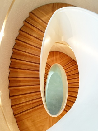
The three stairwells in Newport Street are where this obsessive virtuosity reaches its peak, plunging through the building in great ovoid spirals lined with creamy white brick, as if carved from blocks of butter. The stairs themselves are engineered timber, made in Dresden, while a computer-milled wooden balustrade loops around the inside, mirrored in precast concrete on the outer wall, recessed into the brick and perfectly colour-matched.
“Computer-aided production means it is much more possible to do things like this than it would have been 10 years ago,” says St John. As with the practice’s beguiling staircase at Tate Britain, the architects have mobilised advanced computer technology for precision production to achieve something that feels handmade.
To accomplish this immaculate brick cylinder, which protrudes from the rear facade like the remnant of an old chimney, a laser-guided net of piano wire was set up, against which the bricks were laid, while the bricks on the ceiling were specially precast off-site into concrete slabs and craned into place. The Herculean effort has paid off: they have achieved the crafted quality reminiscent of 19th-century public building, rarely seen today.
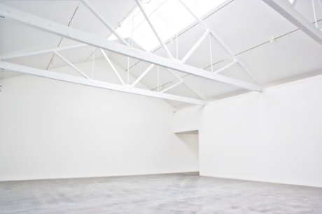
The staircase is spiral, St John adds, “so it brings you back to where you started”, completing the ascension in an exact double revolution. The stairs provide a bit of relief from the blank whiteness of the galleries too, which have mainly been bleached of their industrial character in pursuit of a white-cube aesthetic. It might have been nice to let the feeling of the old studios seep through a bit more, but the rooms at least retain their subtly wonky geometries and the odd exposed truss, to remind you of their past life.

So far, so un-Hirst-like – until you get to the restaurant, where he has let rip in true mid-90s style, as if the recession never happened. Pharmacy 2, as the place is called in homage to the short-lived venue he opened in Notting Hill in 1998 (now an M&S), is a riot of medically themed kitsch, a gloriously tacky shrine to the artist’s clinical obsessions. The contents of an operating theatre storeroom have been emptied into the glass-topped bar, while the walls are lined with cases of Hirst’s trademark pills and surgical tools. There are drugs everywhere: you can perch on giant polyurethane tablets of Proloprim or Desmopressin at the bar, or recline against Vicodin or Norpramin embroidered into the back of the seating booths. There are big plastic pills embedded into the back of the Jasper Morrison dining chairs, while the terrazzo floor is inlaid with what look like vinyl tablets, until you touch them and realise they are water-jet cut from solid marble. Sadly this den of drug-fuelled opulence won’t open to the public until next year – and, accordingly, no images can be published.
Kooky collection
The gallery opens with a show by painter John Hoyland, whose abstract canvasses of smeary rectangles floating in space somehow echo the walls of the galleries, punctured by the windows. Chief curator Hugh Allan says the gallery will be concentrating on six-month-long one-person shows, to give people a chance to come back and get familiar with the work. He is keen to stress that Hirst’s own work will not be on show: the gallery is specifically for the artist’s 3,000-strong collection to be “shared with the public”, a haul that ranges from his YBA contemporaries to Jeff Koons and Richard Prince, along with pieces that “reflect his morbid fascination with anatomy and death”. As Hirst puts it: “I’ve felt guilt owning work that’s stored away in boxes where no one can see it. Having a space where I can put on shows from the collection is a dream come true.”
There are plenty of other kooky bits and bobs in his collection, from taxidermy tableaux of kittens having tea to totem poles carved by the Native American Haida tribe of British Columbia. A lot of it is big and heavy (the floors of Tate Modern had to be especially reinforced to take Hirst’s shark tank) so Caruso St John have made floors that can withstand 25 tonnes per square metre.
Finally, the right-hand block houses offices for Hirst’s copious staff, aka Science Ltd, along with a shop on the ground floor – a physical home for his Other Criteria outlet, where you can buy all manner of ghoulish Hirst T-shirts, golden skulls and limited edition prints.

The arrival of this vast art hangar in the scruffy Vauxhall backstreets is part of a wider transformation of the area into something of an arts district. The Beaconsfield gallery has occupied a neighbouring railway arch for years, while Charles Asprey is building a new home for the Cabinet Gallery down the road on the edge of Vauxhall Pleasure Gardens, and the revamped Gasworks stands nearby at Oval.
But not everyone is happy about the influx. Among the launderettes and fish shops of Lambeth Walk, directly behind Hirst’s gallery, a vacant unit has been taken over by Creative Sparkworks, a grassroots charity based in the area since 2008 that runs training programmes for young unemployed adults. They have relocated from the nearby Lilian Baylis school, which a developer converted to luxury flats.
“Newport Street Gallery could be a fantastic facility for the community,” says Sylvia Edwards, the charity’s director. “But I fear it’s all part of the growing Shoreditchification of the area. We would love to make connections with them – we’ve written two letters but haven’t heard back.”
From Hirst’s balcony, meanwhile, you are greeted with the full car crash of commercial development that is fast rising on the other side of the building, between here and the river. Opening his full-height glass doors, you are smacked full in the face by Keith Williams’s Carbuncle Cup-nominated tower, which looks like the lumpen result of a Dalek mating with a fridge. You almost feel Hirst’s character would be better suited to one of these show-off shafts than his restrained brick bastion. Perhaps he’s sobered with age. In the context of the brash Dubai-on-Thames, his low-key outpost is a welcome arrival, a model of careful craft by one of the best architects practising in the UK today.
guardian.co.uk © Guardian News & Media Limited 2010
Published via the Guardian News Feed plugin for WordPress.


