For 20 years, Pantone’s Color of the Year has influenced product development and purchasing decisions in multiple industries, including fashion, home furnishings, and industrial design, as well as product, packaging and graphic design.
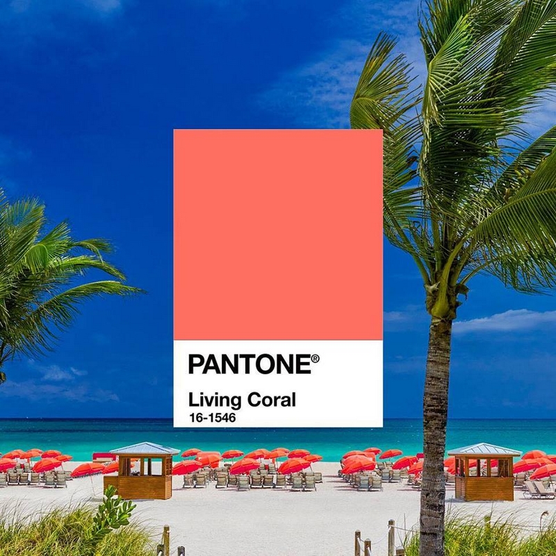
Symbolizing our innate need for optimism and joyful pursuits, PANTONE 16-1546 Living Coral embodies our desire for playful expression.
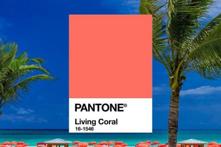
Pantone, provider of professional color standards and digital solutions for the design industry, today announced PANTONE 16-1546 Living Coral as the Pantone Color of the Year 2019, an animating and life-affirming shade of orange with a golden undertone.
Representing the fusion of modern life, PANTONE Living Coral is a nurturing color that appears in our natural surroundings and at the same time, displays a lively presence within social media. “Color is an equalizing lens through which we experience our natural and digital realities and this is particularly true for Living Coral,” said Leatrice Eiseman, Executive Director of the Pantone Color Institute. “With consumers craving human interaction and social connection, the humanizing and heartening qualities displayed by the convivial Pantone Living Coral hit a responsive chord.”
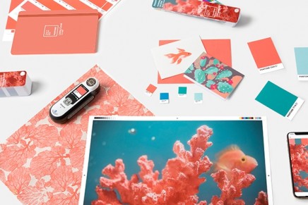
PANTONE 16-1546 Living Coral emits the desired, familiar and energizing aspects of color found in nature. In its glorious, yet unfortunately more elusive, display beneath the sea, this vivifying and effervescent color mesmerizes the eye and mind. Lying at the center of our naturally vivid and chromatic ecosystem, PANTONE Living Coral is evocative of how coral reefs provide shelter to a diverse kaleidoscope of color.
” On the catwalk, similar shades have recently been embraced at Poiret, Temperley London and Elisabetta Franchi. This is colour that promises paradise. It is a subtle, seductive blend, at once fleshy and ethereal, a colour that Pantone calls “natural” yet which, in reality, is exquisitely refined. It is a colour of escape and safety, a colour you can call home,” commented theguardian.
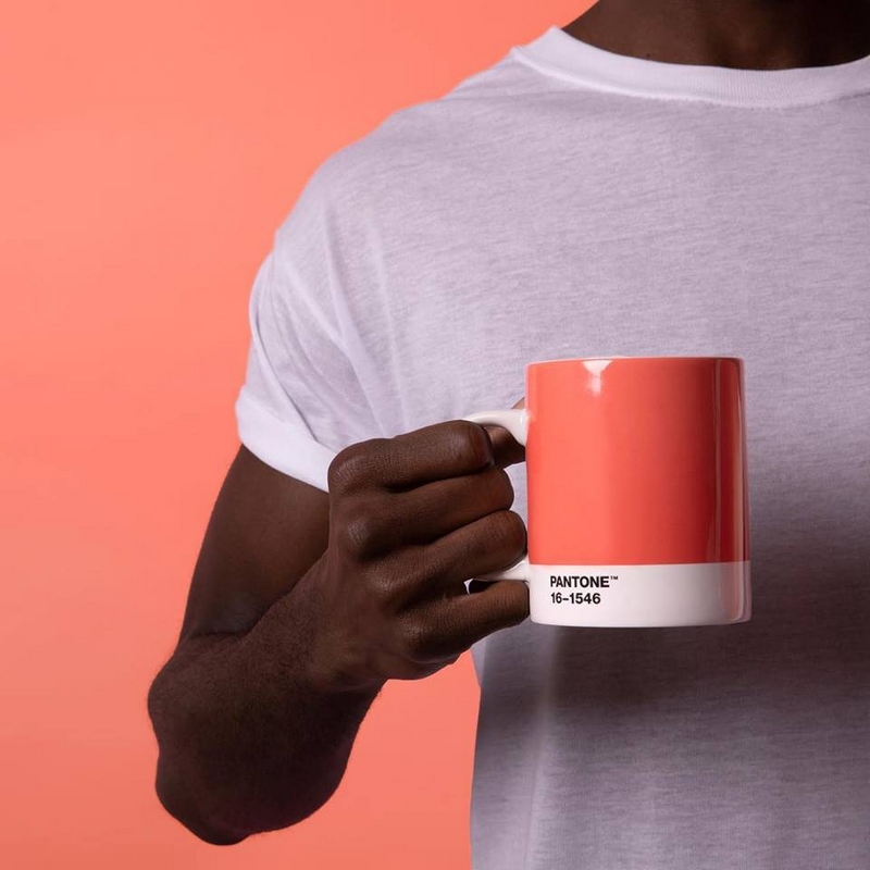
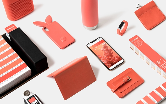
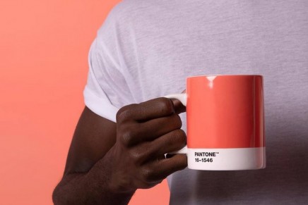
Pantone Color of the Year 2019; Add Living Coral to your everyday routine with a special Color of the Year 2019 mug designed by pantone creative lifestyle; photos: pantone.com
In Social Media
An organic shade, Living Coral is striking in digital mediums, evoking the same inspirational feeling ignited by our natural surroundings. Living Coral’s vibrancy and buoyancy captivates our attention in social media and digital design.
Living Coral inspires experimentation and playful expression in both men’s and women’s street and runway styles. The warm shade suggests comfort and positivity in simple color stories, but becomes more explorative and effervescent in patterns, textures and even monochrome looks.
In Beauty
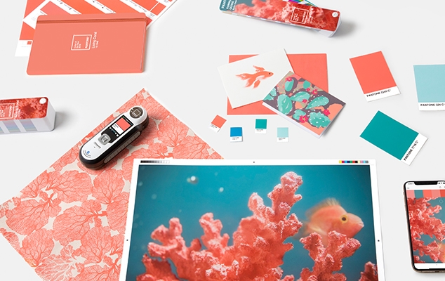
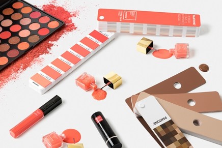
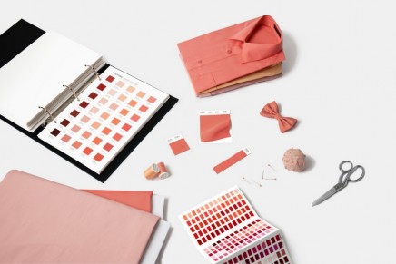
Pantone Living Coral- Pantone Color of the Year 2019; photos: pantone.com
As a life-affirming hue that complements all skin tones, PANTONE Living Coral brings natural color to beauty in blush, eye and lip. Uninhibited, playful looks are also emboldened by Living Coral, which, as the center of a kaleidoscope of color, encourages experimentation in beauty with palettes, textures, shimmers and sheens.
Living Coral is naturally suited for product across all ages and genders. Materials with texture and convivial colors such as PANTONE 16-1546 Living Coral appeal to our desire for products exhibiting humanizing and heartening characteristics.
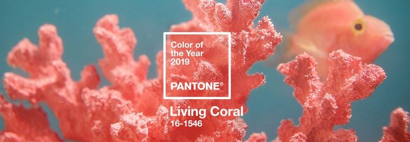
Pantone Living Coral- Pantone Color of the Year 2019; photos: pantone.com
In Interior Décor and Furnishings
When used as a bold statement in settings and décor, Living Coral fosters immersive experiences such as pop-up installations and interactive spaces, tied to a playful spirit. As a color linked to tactility and human connection, PANTONE Living Coral in shag rugs, cozy blankets and lush upholsteries create a warm, comforting and nurturing feeling in the home.
In Packaging Design
Living Coral is naturally ideal for packaging applications. Warm and welcoming, this life affirming shade invites us to reach out and touch.
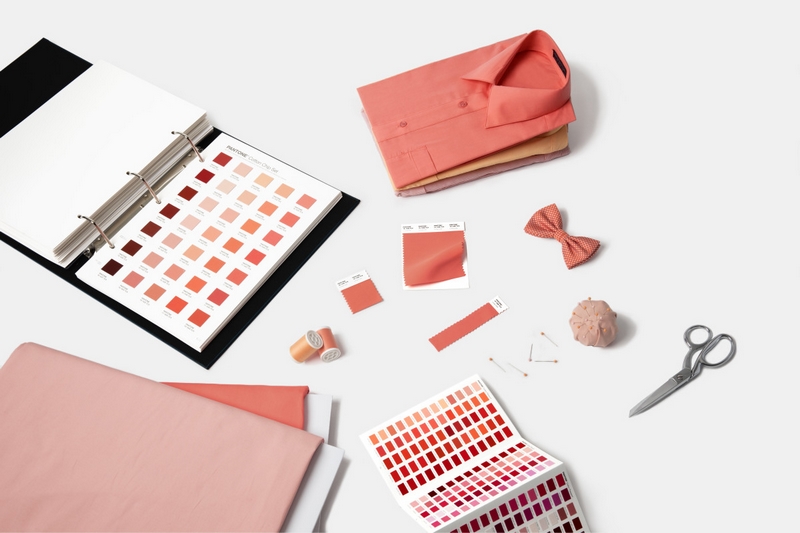
Pantone Living Coral- Pantone Color of the Year 2019; photos: pantone.com
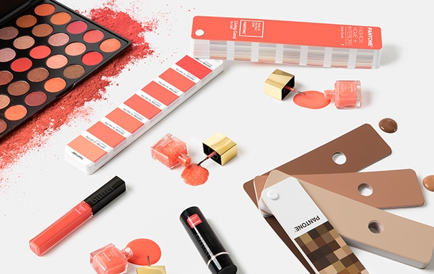
Pantone Living Coral- Pantone Color of the Year 2019; photos: pantone.com

